Chris Padilla/Blog
My passion project! Posts spanning music, art, software, books, and more. Equal parts journal, sketchbook, mixtape, dev diary, and commonplace book.
- 📸 Immich: The alternative for Apple Photos and Google Photos. I've enjoyed it so far. The face-detection AI for grouping photos by person is a slick feature.
- 📺 Tube Archivist: Designed for backing up YouTube videos. I was previously doing this manually with yt-dlp, but this app sits on top and enables a very clever way of managing multiple downloads with plenty of automation baked in. Includes an interface for watching, as well. One of my favorites!
- 🪼 Jellyfin: Plex is the popular choice for media streaming, but I was interested in going forward on all OSS, so Jellyfin was the pick for hosting movies, shows, and my music library. In addition to the web client, it comes with native mobile apps that support downloading locally. I... don't actually watch a ton of movies or shows. But it's been great for hosting my music library!
- 📖 Kavita: I gave BookLore a try, but it seems to be collapsing rapidly. As a comics enjoyer, I liked the looks of Kavita. It groups books within a series rather nicely. And, of course, handles books of words just as well.
- 🐼 Monica: Monica is a CRM for friends and family. Having a personal database is a great container for keeping track of the people that matter most in your life. For a while now, I've taken Derek's advice on this practice, and Monica is actually one of his recommended solutions. Have only used it lightly so far, but it's been the most fulfilling hands down.
- A food item is a task
- Shoppers are a collection of tasks that are scanned via queues
- Cashiers (and self-checkout machines) are workers
- Individual cashier lines are queues
- Human cashiers vs self checkout represents prioritization queues
- Customer Service is, as mentioned, a dead-letter queue
Chapter's End
Blogs are bad at goodbyes and intermissions.
Part of the loveliness is that there are no chapters like a book, no page count to adhere to. They can go on and on. But we're all folks who generally like closures and order.
A week ago marked 5 years of this blog going live. Though the themes and practices around it have been in the works for 7 years since 2019. At the time, I was itching to explore new mediums, searching for a more authentic voice, and ready to start contributing my piece after years of taking influence from so many sources. So I began! I wrote music, picked up new instruments, went pro on software work, and was soon putting words on the internet.
Through the process of working on this dot com stage, I had real fuel to continually find the answer to what it was I wanted to make and share. Largely, it's been a mailbox full of love letters: to musicians, developers, writers, and artists. You end up learning to see these things more closely when trying to imitate and remix. And so I've had many years to deconstruct the inner workings of all sorts of genres and media.
In my mind, I was reaching for destinations. I have so many peers who adore traveling. I like to think this is my version of it. Going behind the scenes of these practices, getting a tactile understanding of what the process looks like. Overly romantic, maybe, but true all the same.
The more broadly I traveled, though, the more I realized that the sensations: flow state, inspiration, study, craft. These weren't mutually exclusive to any individual practice. The constellation made it clear that the cliché is correct — what you end up searching for has been here all along.
Not only that, but after 7 years of devoted work, it turns out I've reached where I was aiming to go. There's always more to learn, of course, and no one ever fully arrives. But I've gradually gone from "It would be great to paint something like this" to "Hey, I've painted something like this!"
It's that duality of a rewarding sensation from reaching the top of a mountain, and then wondering, a bit nervously, "What next?"
All this to say I'm at a chapter's end.
I'll be considering myself on hiatus from this site. No current plan or intent one way or the other on returning. To be determined. I'll be taking the time to see what comes up next.
Many of the ideas that made it here were born during a stretch of time when I wasn't working on a major body of creative output. Closing out the site for a while is not saying no to meaningful work, but saying yes to the silence that allows for more to come through.
It's not seen as much on here, but I'm also more interested in the sketches, drawn or otherwise. Any online bucket builds up expectation. There's the quiet thought, even if it's self-imposed, to rip through another finished piece. The pause is to help start fresh and see what blooms naturally.
A big motivator of all creative practices, including the blog, has been a desire to capture life in a way that the beauty grabs even a fraction of the inspiration. And so what if the most creative work is in how we choose to live our days and be with them? As much as I adore all of these media: written, aural, and visual, they all pale in comparison to the lived experience. Perhaps it’s time to stop assuming that these feelings are only really had on the other side of a detailed rendering, a sweet phrasing of a melody, or finding the perfect word. It’s already here, and it always has been.
I’m a big believer in an idea that has developed from all of this work. That life is richer when reflected on. That won’t be going away from my routine; there’s still plenty of room for sketchbooks, journals, and other private means of doing all that. The pause is here online.
So who knows. Maybe a hiatus. Maybe a week, maybe a year. Maybe the end of the book on this particular project. It’s not so much about giving up on a site, an app, a painting, a project. So long as we’re still guided by curiosity, enthusiasm, and whatever is authentic. It doesn’t entirely matter what the canvas is, or how large it is, or how many rooms you can fill with paintings.
Well, we'll see. For now — Au revoir!
AI Feature Application Layer
A curious thing about AI apps, given that there is minimal UI, and that largely the UI of an AI app is through text, is that from a user standpoint in this new world, it’s not clear what the business app is, and what the AI technology is. At the very least, it’s easy to conflate the two if you’re unfamiliar. The LLM, vendor, be it OpenAI, Anthropic, Gemini. And the logic that sits on top that makes it work to accomplish whatever business-specific goal needs accomplishing.
An interesting illustration for this would be looking at the difference between LangGraph and LangChain’s ReAct Agent.
The LangChain Reacts Agent is a quick wiring up of a few different things. A system, prompt, which guides the vendor’s LLM on what is trying to be accomplished. A series of tools, typically API interactions that the LLM can invoke if needed. And then the user prompt, of course. The actual input provided by your user.
In LangGraph, unless you use this package, you don’t have access to this. What you’re doing instead is creating a series of nodes, edges, and logic, for how to incorporate all these pieces.
As an example, say I want to know how the Houston Astros are doing during their game today. I ask my Astros AI app if there’s a game going on, and what the current score is.
Here’s what needs to happen. This is all hypothetical, so we’ll walk through a few scenarios of how this could move around. My message is received by the application, let’s say the application is built with LangGraph. We may want to decipher the intent of the message, one way or another. Say that this AI is responsible for a number of things, sports scores for the Astros only being one of them. We may have our first node triaging what the question is that’s being asked. Once we ascertain that it’s about the score for the Astros, we can pass this along to the appropriate node for this. It’s best that we give each node individual responsibilities, in the same way that we have classes and components in our code bases individual responsibilities. Worth noting that we can have parent and child relationships here as well. Nodes can contain graphs within them.
It gets tricky from here to have an example, because much of how we structure this is partly dependent on the supporting API. Let’s assume that I have an endpoint where I can simply pass in a sports team and a date of a game — getting a score back. Once we’ve brought these details our score node, I can then call the appropriate API. This is either accomplished manually there, by extracting the team at a previous point, and then passing it to my API, or it is provided as a tool when we insert a React agent.
Once I get the score back, then I want to generate a human-readable message from the JSON. Perhaps there’s a separate node specifically for this once we have all the pertinent details. We navigate to that node, and another LLM is responsible for receiving a prompt specifically for turning the information we’ve gathered into a human-readable message. This could be a single-shot or a multi-shot interaction. Perhaps we generate an initial message as a draft, and then we clean it up with any communication policies. It’s at this point that we can then send the information off.
It gets more sophisticated from here. Say that the user includes multiple requests within one message. There’s been a need for an iterative approach to this. Perhaps a paragraph is responsible for creating a to-do list based on the user’s input, and then cycling through indications of notes and subgraphs to check off each item on the list. And then a summarizing message can be formed and cleaned up at the end.
A great deal of piping! But the development work doesn’t stop there. Given that these applications are famously non-deterministic, the amount of testing that goes into building these is high. There’s automated testing that can be done: unit, integration, graph traversal. For LLM-generated responses, evals will need to be put into place, and even so, these need manual review and iteration to match tone and catch hallucination.
In the same swoop that AI assistant coding tools are becoming really sophisticated, so is the bar for the AI applications that we’re developing. The point of all this being that, even in what seems like simple requests, there’s still a heavy amount of engineering and iteration to get to these places. Some would argue that it turns out that the LLM is not actually the most interesting part. It’s the many ways that we can develop an application on top of these. Much like any typical backend feature, a great deal of magic to the user, an interesting puzzle to all the teams that are bringing these new features to life.
Vivi Sketch
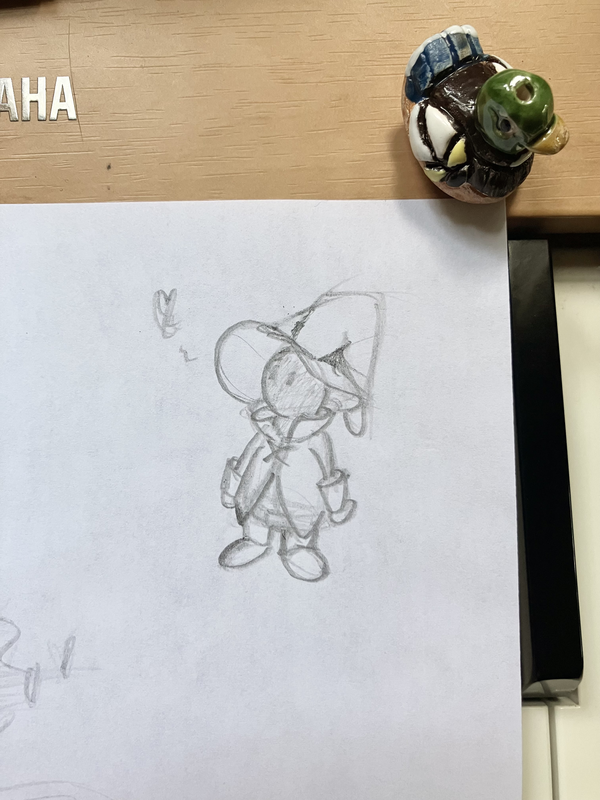
Started playing a bit of FFIX the other day. Vivi is too sweet.
I Ride an Old Paint
🐴
Liszt – Liebestraum No 3 (arranged) Revisited
Revisiting this one. So romantic.
Constructing Everyday Objects
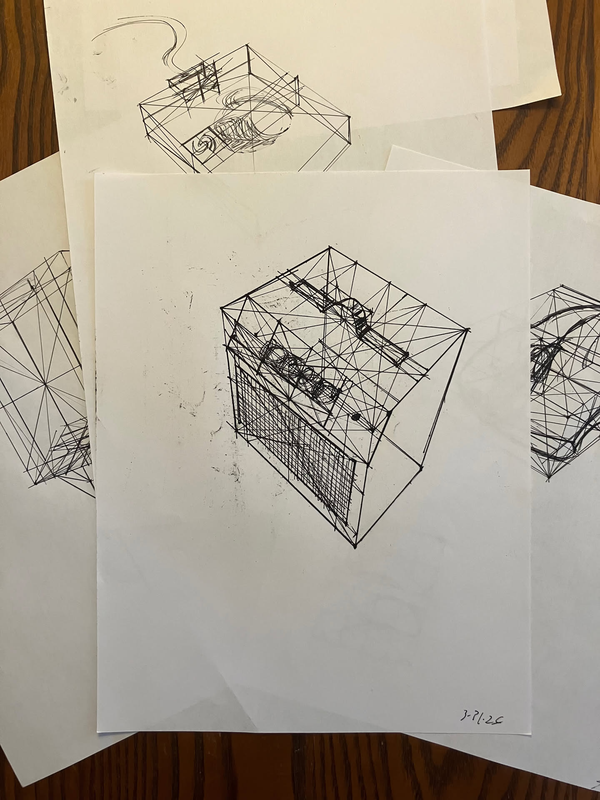
Construction studies while working through Draw A Box. I remember these looking pretty intimidating with all of the different additional lines to measure out the form. Not as bad once you get into the groove. Nice to have some pattern matching, feels similar to programming, even! 🤘
David Whyte — Rainforest
From The Heart Aroused:
The abiding image of a diverse and rich ecology is the Amazon rainforest. As human beings, we look at the rainforest and see an ecology made up of thousands of species that fit together exquisitely. The image is so satisfying to us, because when we see the forest, and all the disparate forms, odors, and cries that make it up, we intuit a life where all our own strange and eccentrically exotic parts can fit too. A place where the cross-grain of experience makes not a disconnect, but a mysterious, embracing pattern. A balanced, intricate ecology, in effect, asks us to stop choosing between parts of ourselves, according to what we think belongs and what does not. A mature ecology needs its microscopic leaf molds as much as its panthers. It does not make a choice between them, saying, “I’ll take three dozen of those gorgeous Panthers, and cancel the tacky leaf molds.” If it did, the rainforest would soon, as the metaphor goes, be out of business. No leaf molds, no compost. No compost, no life.
Ursula's Painting
From The Art of Kiki's Delivery Service, Hayao Miyazaki on Ursula's painting:
“It doesn’t matter what Ursula paints as long as it’s spirited. Given how her painting is thematically related to the film, the actual paintings had to be powerful. The paintings convey the life of a secluded female artist more than they do some message. I was looking forward to drawing them myself once I was done with the storyboards [laughs]. When I couldn’t afford to do so, I recalled the print, ‘Ship Flying Over the Rainbow.’ The print was made by a teacher at a school for the disabled, Hachinohe City Minato Special Junior High School. We obtained permission from the instructor and added a face to the original illustration. Replacing the horse’s face with Kiki’s would have been inconceivable.”
The original illustration wasn't colored, so credits in the film show:
"Ship Flying Over The Rainbow"
Painted by students of Hachinohe City Minato Special Junior High School Handicapped Children's Class
Lovely.
99% Perspiration
From Walt Stanchfield's Gesture Drawing for Animation, a favorite around here:
It all starts with preparation, which is the “open sesame” of all genius. Even the geniuses admit it’s 99% hard work and 1% genius.
In context, this is talking about capturing "The Essence" of an image. For the layman to a craft, it's what they would imagine is most of the work going into the piece. The emotion, the story, the idea.
Starting to learn drawing a few years ago, I thought ideas would be the hard part. Turned out that I had ideas pouring out of my ears! Enough so that I couldn't keep up with them all.
And so the idea is the easy part. Most of the time is spent in the trenches, working with craft.
A gesture is accomplished through a complex array of skills working in tandem: composition, perspective, anatomy, construction, expression, draftsmanship, inking, shading, and value. And each of those are sophistications unto itself.
This is, mostly, relieving. Craft can be improved, and craft is much more sustainable to work at over a long stretch of time. I find craft to be grounding; it's the thing that aligns you with the beauty of it all, and it's the way we become the image, the piece, and so on.
I write this as I'm slowing the pace of output on this ol' dot com so I can spend more time learning and honing craft. I'm trading finished works for etude books and study material. It's a quiet learning sabbatical, with occasional transmissions from the underground where the roots are being laid. With time, some nice fruit should bloom from it. But until then, on with craft.
Manus — Straight Jig
Getting jiggy with it!
Forays Into Home Lab Apps
I'm dipping my toes into the rabbit hole of Home Labbing (or, perhaps, am tripping down the loose gravel that is rapidly dropping me down into the vast expanse of it!)
I've seen discourse around Synology setups, home NAS systems, and really sophisticated data back up stragies. This just seemed right up my alley — the intersection of managing apps, data, and oh — by the way — that data can include all sorts of stuff I care about: my ripped CDs from the 2000s, my collection of ebooks, and pictures from all of my vacations??
I'll hit the highlights — my laughably minimal setup as I'm just getting started, the apps I'm running, and my two cents on the experience so far.
The Setup — Keeping It Simple
So far, the number of people who care about this in my household is 1 — me. I have little need for the N in NAS (Network-Attached Storage) and am having fun setting things up on my laptop.
That said, a DAS (Direct-attached Storage) box is out of the budget while I'm just experimenting. A NAS can run $1,000, while a DAS trails behind slightly. Not the price point for a maiden voyage.
Those deeply entrenched in this hobby may scoff at this, but my current solution is — drum roll please — an external hard drive. I simply slap this into my computer directly, run all my apps on my machine, and then access them on the same machine.
This skips over a lot of what looks fun for a maturing setup: building a machine, ordering parts, setting up the network, getting an Uninterruptible Power Supply, etc. But I was starting to get educated with all of this only to realize it was keeping me from getting started in the first place.
So yes, I'm excited to eventually have hardware to talk about and neat networking approaches at a later time. But for now, keeping it simple is keeping me moving.
Worth saying: I have employed for a while now the 3-2-1 backup strategy. I have a primary drive, a mirrored drive, and have the primary backed up to the cloud via BackBlaze. Wes Bos gives a great pitch for why he uses BackBlaze on Syntax.
Now is also a good time to shout out FreeFileSync, a handy bit of OSS that I've used since 2010. This helped with migrating files and currently makes keeping drives in sync painless. It's manual, but it still works wonderfully. I've also picked up DaisyDisk for getting a visual on what's taking up how much space on any given drive.
Apps!
Pretty much all of these are run as Docker Containers on my machine, keeping themselves contained and incredibly simple to set up. I'm just wrapping up getting each populated with data, and for the most part, all you need to do is point it to the directory you want data pulled from, and then you're done. There was no issue with having the app on my machine and the data on another drive, so long as it's connected, of course.
Here's what I've got so far:
How It's Going So Far
This has been supremely enjoyable on many fronts!
Parsing data, collecting it, reorganizing it, and digging deep into my own personal archive has been naturally nostalgic. Plenty of "wow, I forgot all about this!" arose along the way. This goes for my personal photos, music collection, and even YouTube series that I previously enjoyed. Tending the garden allows us to "live twice," enjoying the highlights all over again.
Data loss is something I've been burned by before. Growing up, my own technical experiments pushed our Windows 98 machine to breaking a few times, to the point where the only solution was a clean install. On the subject of YouTube in particular, I've been frustrated to see videos disappear for one reason or another. Setting up this homelab of sorts only further solidified my own backup strategy, and now more easily facilitates backing up other ephemeral media.
On top of that — I'm much more likely to actually engage with what's stored as well! These apps provide an enjoyable interface that actual keeps me coming back. A huge improvement from finder!
And, of course, as a technologist, the setup is the most fun part. Along the way, I've spun up Docker Containers, written migration scripts, used new CLI apps, and just had a ball on the computer! It's exciting (daunting? terrifying?) that there's much more to do in the realm of hardware in this space, and I'm looking forward to branching out that way when the time comes!
I share this not to impress anyone with how tricked out my setup is (clearly), but to encourage you. If you're looking to get going, you don't have to wait for hardware. Roll up your sleeves and start tinkering!
Faber — Phantom of the Keys
Nothing says spooky like the chromatic scale!
Monotasking with AI Agents
I've been seeing great gains in one open window for AI coding assistant like Claude Code, but then heard that the real productivity boost was to have multiple in-flight. The velocity gains seemed exciting, and there was ample downtime between prompt and response. So I decided to give it a whirl over a couple of weekends.
I tried this with terminal tabs first, then dabbled in UI's that build around this philosphy such as Conductor, and even ogled at the wildness that is Gas Town. (Maggie Appleton is recommended reading on this wild speculative experiment towards agent orchestration).
If you haven't given this workflow a go, I have to warn you that it is initially exhilarating. The jumping back and forth between tasks and typing into being solutions and features is addictive. There's an intoxication to see work that took ages being trivialized in parallel.
Naturally, though, this way of working has tremendous tradeoffs. First — throughput becomes the priority over quality. When there are other tasks waiting to be addressed, a given task that requires pause leads to impatience, making it all the more tempting to skim code generated, gloss over details, and obviously make mistakes. So more is done, but worse than before.
There's, of course, our mental wiring as well. There is plenty of research out there supporting that our minds are terrible multitaskers. We do not truly run multiple threads — it's all one thread, but with the ability to be interrupted and switch tasks quickly to give the illusion of multitasking. This can be stimulating (hello social media), but it is also incredibly expensive. So this mode of working is actually more demanding, not less — a complete reversal to how AI products get marketed. This means being absolutely exhausted quickly. But, because the next prompt always contains the chance of a high reward with low effort, you want to keep going. Then, much like above, you are pressured into poor choices and skimming because of the fatigue on top of the throughput prioritization.1
I found myself especially susceptible to this — when looking for more to put in flight, I ended up adding tasks and features that were low impact. So I might have a medium-priority task in flight, and be working on a smaller feature on the side. But, eventually, that small feature that was only supposed to take a few minutes ballooned into a larger problem that spiraled. Now I'm stuck working on both, and that additional feature likely didn't even need to be on my plate in the first place. The cost to onramp is low, so the complexities were underestimated against the more trivial priority.
So, when working with AI coding agents in this way, I was developing brittle features and fixes, spending more time on low-priority tasks that took away from my high-priority ones, and I was more exhausted than ever before from development. This experiment was clearly a failure.
A major concern many engineers have around developing with AI assistance is a less thorough understanding of what they are developing. Hence the term vibe coding. This approach only exacerbates the issue. Forget being rusty with JavaScript — I wasn't retaining the attributes of the features I was working on as a result of this practice. A scary position!
This is not all that different from work modes before agentic coding tools. Monotasking and Deep Work are long-advocated principles that have always worked, and the introduction of the shiny new tool makes no difference here.
The alternate title to this would be "I Tried Multitasking Developing With Claude Code So You Don't Have To". So beware the temptation! The time when the tools are processing your prompt is better spent thinking further on the problem. These tools, while trying to lead with generation, are still most useful to me when I spend ample time using them to think more deeply and efficiently around a problem rather than over-delegating to them.
Even further still — it's better to ignore the hype of 10X productivity that's seen buzzing around, and instead aim for just a bit more efficient for greater sanity and ownership over the work at hand.
1 Steve Yegge, developer of Gas Town, returns to warn of this exact thing in The AI Vampire.
Queues of Queues at the Grocery Store
There's an idea that's tickled me lately — the idea that a queueing problem can sometimes be tackled by employing... more queues!
Looking at the world around us, in a small retail store, one cashier and one queue can suffice. But in a grocery store, that is typically insufficient. During peak hours, it takes multiple cashiers to check out customers with their own individual queues.
Interestingly, they are also self-organizing thanks to individual customers having autonomy in the line that they chose. A customer can look at all open cashiers at a glance, see how many people are in line, and even further — can see which ones are being clogged up (by customers with large baskets, customers paying cash vs card, customers searching glacially for all the coupons they clipped that morning).
Most stores have an element of prioritization based on the workload as well. Cashiers are great at handling shoppers purchasing food for the week. Self-checkout, which has its own queue, is best suited for those with < 15 items. There is an entirely separate queue for these shoppers.
You could get granular here — each shopper within their cart ultimately constructs a queue of items that are scanned in an arbitrary order.
There's even a dead-letter queue in many humble grocery stores! My local stores have a customer service desk where you can communicate with a manager who has the ability to review your order, what went wrong, and has extra permissions to resolve an issue.
This all, of course, maps to software.
In terms of systems:
Is it overly obvious that I thought about this while standing, perhaps too long, in line at the store this weekend?
Studying Planes of the Head
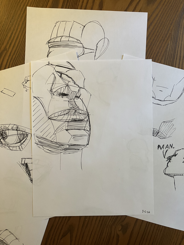
Giving my +1 for Marco Bucci's Understanding & Painting The Head! Thorough without being bogged down in the weeds, classic Bucci teaching. Learned a lot from it!